Hero
Establishes the primary visual direction and immediately communicates the streaming experience.
A visual recreation of a Netflix-style landing page, created as a UI practice project focused on layout, visual hierarchy, responsive design and interaction details.
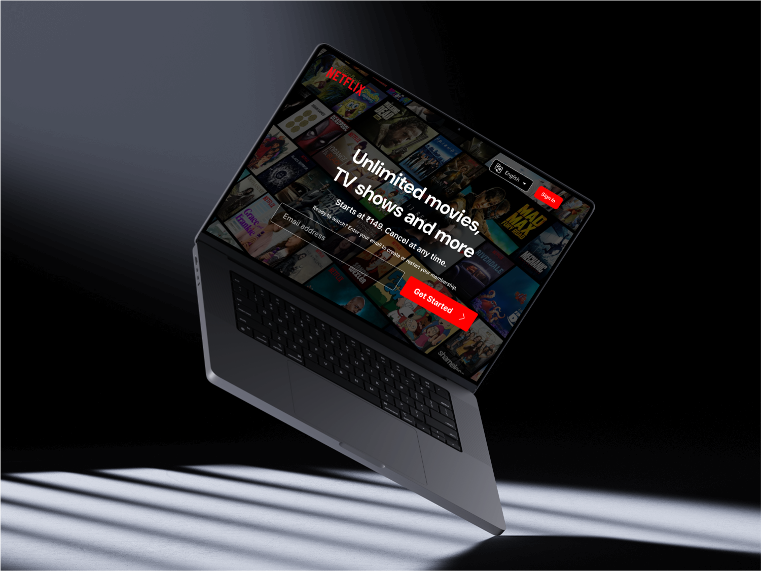
This project explores the visual structure of a Netflix-inspired streaming landing page.
The focus was on recreating a strong entertainment interface using clear visual hierarchy, large imagery, content sections and responsive layouts.
This is an independent practice / clone project. It is not an official Netflix project and is not affiliated with Netflix.

The primary landing page focuses on a strong hero, prominent content hierarchy and a clear streaming experience.
The interface uses visual scale to guide attention through the page.
Establishes the primary visual direction and immediately communicates the streaming experience.
Organizes entertainment content into visually recognizable sections.
Keeps the major areas of the experience easy to discover.

A content-focused section designed to create a recognizable streaming catalogue experience.

Supporting information is structured into a clear FAQ section to maintain the visual rhythm of the page.
Large imagery and typography help establish clear attention levels.
Distinct sections make the long-form landing page easier to scan.
The interface is structured to adapt across desktop, tablet and mobile layouts.
Repeated visual patterns help create a cohesive entertainment-focused interface.
This project helped explore layout composition, content hierarchy, responsive structure and visual consistency within a familiar streaming interface.